

By Hieronimus Agung Prasetya Senior Product Designer (UI/UX) @ PT ITSEC Asia Tbk
Originally published on Medium — reposting here because this hits closest to home in UX work: a grid system tells you where to start, not whether the result actually fits your content.
“Hey, I think we need a web dashboard to support the IntelliBroń Aman mobile app.”
That message came from the Product Manager one afternoon.
For context, IntelliBroń Aman is a cybersecurity DNS resolver designed for mobile users. It helps filter malicious domains and strengthens network security by protecting users from potentially harmful websites before they can even be reached.
My first reaction? Honestly… resistance.
“The mobile app already works great. Why would we need a web dashboard?”
But product development rarely stays in one place. The application was originally built for individual consumers. As the product matured, however, a new opportunity emerged. Enterprise customers wanted more than just protection: they wanted visibility.
Organizations wanted to monitor DNS traffic, analyze blocked threats, observe resolver performance, and gain real-time security insights across their networks. At that point, a dashboard wasn’t just a nice-to-have feature anymore.
It became inevitable.
So… Challenge accepted.
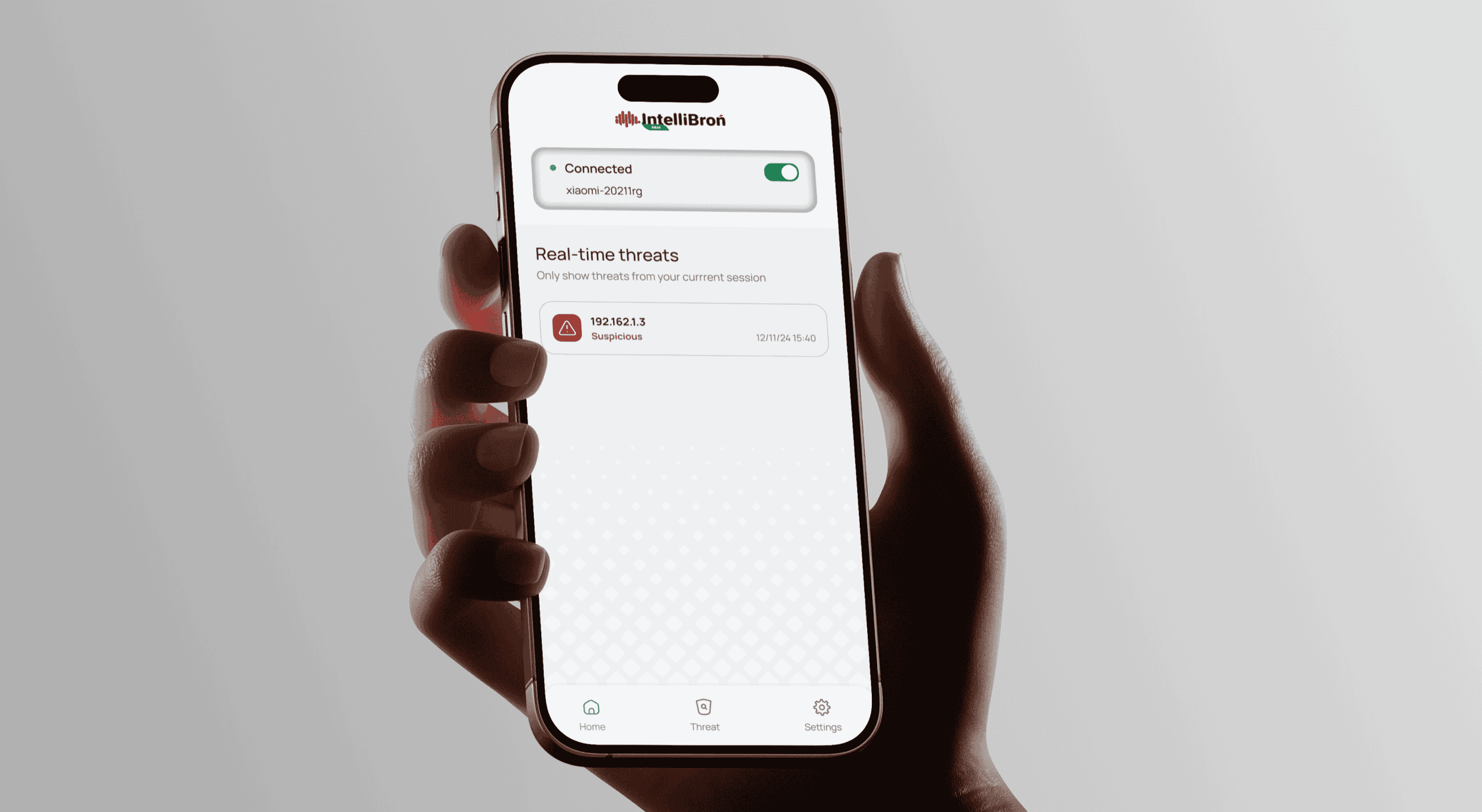
Designing a dashboard for a cybersecurity product feels a bit like untangling the cables behind a server rack. Everything is connected, seems important, and every single metric is competing for your attention. It’s almost as if the data is shouting:
Look at me!
On a single screen, the dashboard needed to present information such as:
- Resolver latency
- DNS query volume
- Blocked domains
- Traffic patterns
- Potential malware threats
- System health
- Connected devices
- Active IP addresses
- …and more.
The real challenge wasn’t collecting the data.
The challenge was presenting all of it in a way that people could actually understand without overwhelming them or causing dashboard fatigue.
Things became even more interesting because our users fell into two completely different groups.
Technical users (B2B) — network engineers, security analysts, IT administrators. They want deep operational insight so they can investigate incidents and decide quickly.
General users (B2C) — everyday people with little or no technical background. They aren’t interested in DNS resolution times or traffic anomalies. They want the answer to one question:
“Am I safe?”
That became our mission. Not just to build another security dashboard but to design one that could make complex cybersecurity data feel surprisingly comfortable to read.
Looking for Answers in the Nature
At first, I tried all the usual approaches experimented with different layouts, simplified the charts, removed unnecessary visual elements.
Yet something still felt… off.
The dashboard looked cleaner, but it didn’t feel easier to use. There was no natural flow guiding users through the information. Every iteration solved one problem while introducing another.
Then, during one of those moments when I am stuck and my brain refuses to cooperate, I put on Lateralus album by TOOL.
If you know the album, you probably know TOOL hides mathematical patterns in their music. The title track builds its vocal syllables on the Fibonacci sequence 1, 1, 2, 3, 5, 8, 13, then back down again.
The mathematics of Lateralus
TOOL’s music is genuinely complex: odd time meters, polyrhythms, triplet subdivisions, and song structures that don’t repeat when you expect them to. By every reasonable measure, it should be exhausting to listen to. It isn’t. And they never make it simpler to achieve that. The complexity stays fully intact; it’s simply arranged so your attention always knows where to go next.
”How does TOOL keep something so complex, yet still make it enjoyable?”
The Golden Ratio
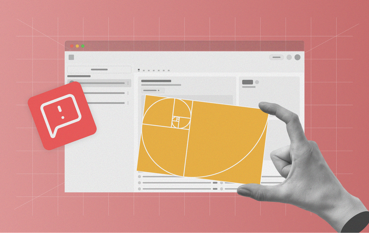
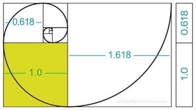
The idea is simple. When a line is divided into two parts, and the ratio of the whole line to the longer segment equals the ratio of the longer segment to the shorter one, the result is a constant of approximately 1.618.
The most credible natural example is phyllotaxis: the arrangement of leaves, seeds, and petals in plants. Sunflower seed heads and pine cones really do follow Fibonacci counts, and there’s a biological reason: it’s an efficient packing strategy that maximizes light exposure and space.
A quick note, because it matters for what follows: a lot of the popular examples are weaker than they sound.
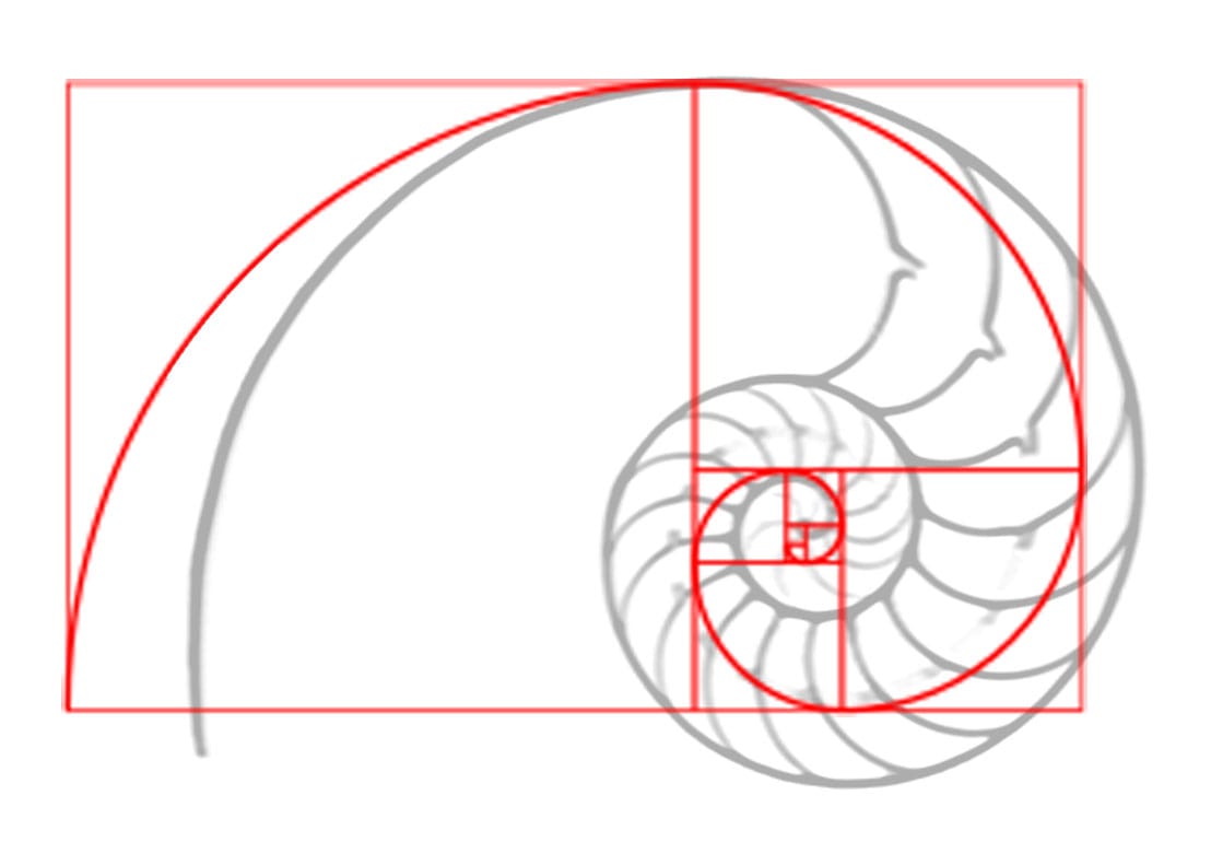
The nautilus shell is a logarithmic spiral, but its growth ratio is closer to 1.33 than 1.618. Spiral galaxies vary enormously in pitch angle. And there’s no documentary evidence that the architects of the Parthenon used φ. That interpretation came centuries later and depends heavily on where you decide to draw the measuring lines.
I mention this because I started this project believing the Golden Ratio was a law of nature. It isn’t. It’s a proportion that shows up sometimes, for real reasons, in specific systems. That distinction turned out to matter later. That sparked another question:
What if the dashboard followed the same rhythm found in nature?
Not simply to make the interface look beautiful, but to make it feel intuitive before the user even realized why.
The Plan
“The best interface is the one users never have to think about.” — Jef Raskin
I think of this as silent architecture, a structure that works behind the scenes, helping users understand information without demanding their attention.
Contrary to what many people assume, the first design decision wasn’t colour or typography. It was deciding how the screen should be divided.
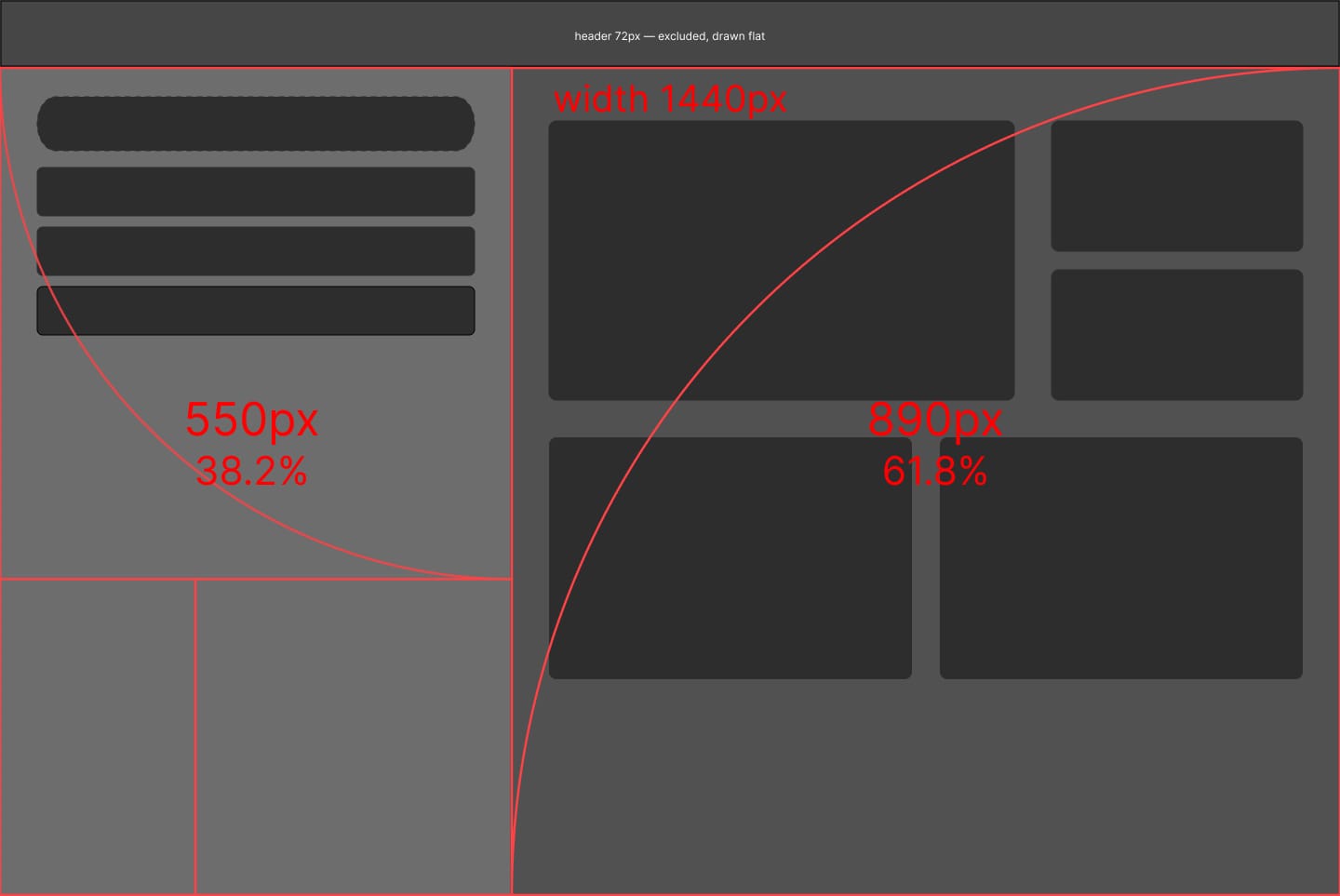
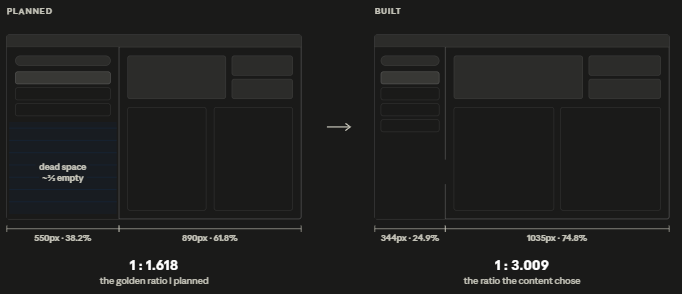
I opened a 1440px frame and split it using the Golden Ratio:
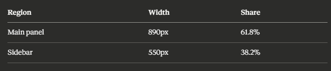
Mathematically clean. and it was obviously wrong.
The sidebar holds a profile list, an “Add Profile” button, and a handful of protected profile rows. Each row is an avatar, a name, and an overflow menu. At 550px, roughly two-thirds of that column was empty. Not breathing room. Dead space, on some of the most valuable real estate in the layout.
What the Content Decided
I stopped asking what the ratio wanted and asked what the sidebar needed.
The answer was measurable. Enough width for the longest expected profile name. The avatar. The overflow menu's touch target. Padding that doesn't feel cramped. Add those up and the column lands at 344px.
The rest of the frame went to the data. Here's the layout as built:
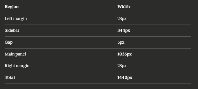
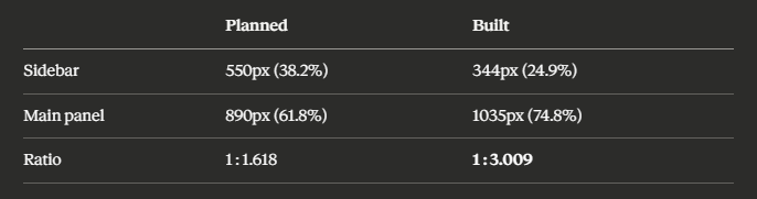
Not the golden ratio. Not close to it. Not a near-miss I could round toward. What I shipped is essentially 1:3, the most ordinary proportion available.
And here’s the part worth sitting with: at no point did I decide on 1:3. There was no iteration where I chose it. The sidebar became as wide as its content required, and everything left over went to the data. The ratio was the result. I had been calling it the method.
Why It Broke, Where it Broke
Once I stopped defending the ratio, the reason it failed became easy to name.
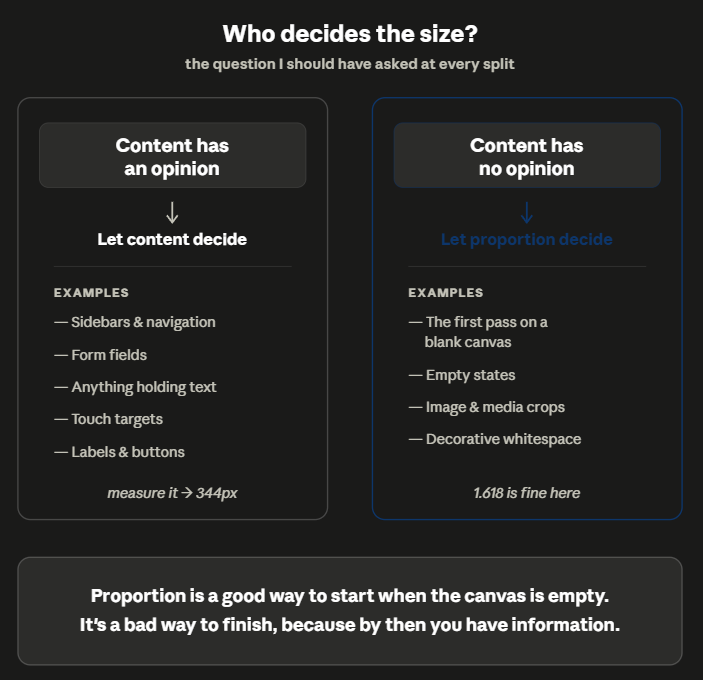
The sidebar’s width is set by functional constraints: text length, avatar size, touch target, padding. These are measurable requirements with correct answers. A proportion system has no opinion about how long someone’s name is. Force one, and you get a column sized for mathematics instead of for people.
That’s not a flaw in the Golden Ratio. It’s a category error in how I applied it. I reached for a rule in a place that needed a measurement.
Which suggests where a proportion system is useful: the moment before you have any information. An empty artboard is genuinely paralysing, and 61.8/38.2 is a perfectly good way to break the deadlock and get something on screen that you can react to. It did that job. It just isn’t supposed to survive first contact with real content.
Proportion is a good way to start when the canvas is empty and you have no information. It’s a bad way to finish, because by then you do.
— Agung
The Number I Almost Published
There’s a smaller confession attached to this, and I think it’s the most useful part of the article.
When I sat down to write this piece, my notes said 61.8 and 38.2. I had written them down at the start of the project because that was the principle I believed I was working from. I didn’t check them against the file until I needed the exact pixel values for a diagram.
That is exactly how the Parthenon gets retroactively fitted with a Golden Rectangle. Someone measures a beautiful thing, finds a satisfying number somewhere nearby, and the number becomes the explanation. I did it to my own work within a year, with the file open on my own machine.
Nobody sets out to manufacture a myth. You just write down your intention and forget to go back.
So the practical version of the lesson:
Write down the number the actual content gave you, not the number you started with.
— Agung
344 and 1035 tell me something real about this product: how much room a profile name needs, and how much space a security team wants for data.
550 and 890 only tell me what I was reading that week.
Two Audiences, One Screen
One thing the layout did get right, and I want to give it credit for, is this.
I originally labelled the regions dominant and supporting. That was wrong, not proportionally, but conceptually. The smaller region isn’t supporting for everyone. For B2C users, it’s the main thing they interact with. Supporting described my layout, not my users.
So the regions are named by function now:
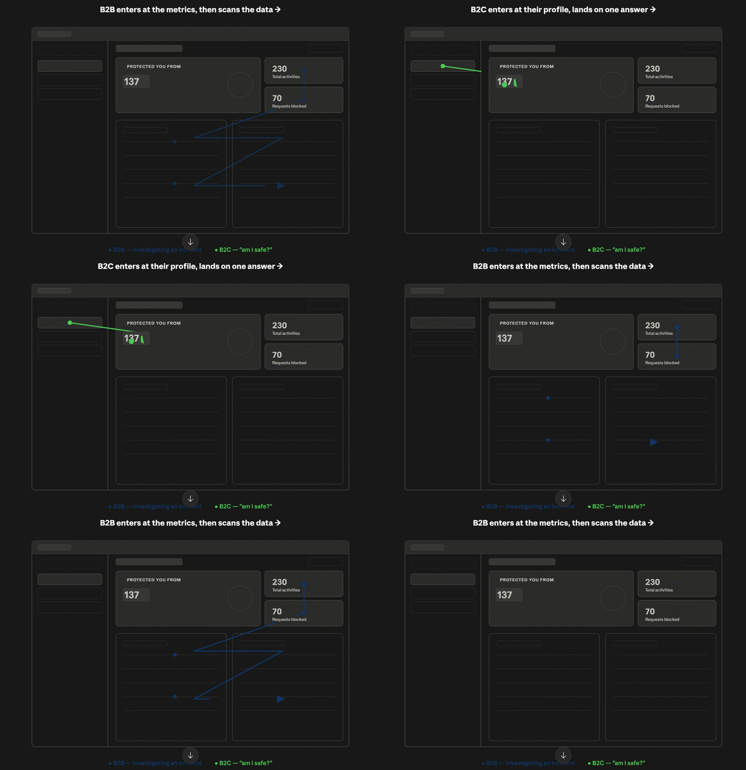
Insight cluster — threat visualization, DNS traffic analytics, network activity, real-time metrics. Where technical users live.
Control cluster— profile management, device selection, system controls. Where B2C users spend their time, answering “am I safe?” without requiring anyone to read a chart.
Same screen, two entry points, no mode switch. The hierarchy isn’t fixed; it depends on who’s looking.
And it points to something the layout can’t take credit for. A non-technical user can answer “Am I safe?” without reading a chart, but that’s the words on the screen doing the work, not the boxes around them. That copy is our UX writer’s, not mine.
I’ve spent this article crediting measurement and proportion, but a good half of what makes this screen legible is language I didn’t write. Design isn’t only where things go. It’s what they say once they get there.
What Actually Changed
I can’t tell you this design is measurably easier to use because we haven’t run formal usability testing yet. I’d rather say that plainly than imply evidence I don’t have.
What I can report is structural, and you can check it against the file yourself:
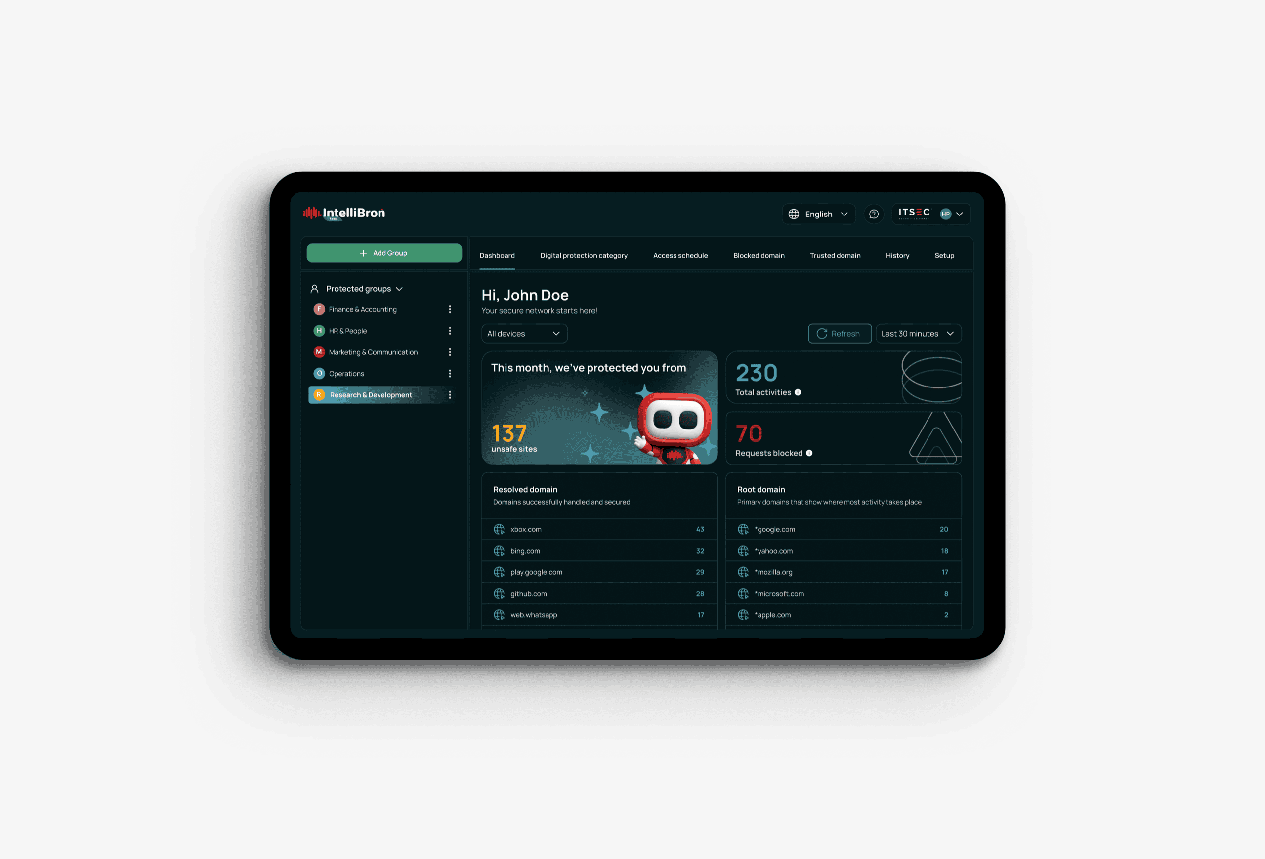
- On first load, the shipped layout resolves into a handful of primary regions. A profile sidebar, one hero summary that answers “Am I safe?” at a glance, and two metric cards instead of a flat field of equally weighted tiles.
- The two audiences enter at different points (control on the left, insight on the right) without the screen needing a mode switch.
I won’t give you a precise “competing elements dropped from X to Y” number. The earlier layout wasn’t preserved as a clean comparison frame, and “number of competing elements” is a judgement call, not a metric I’m willing to fake precision on. In an article about measuring instead of remembering, that would be a strange way to end.
If you came here hoping for proof that 1.618 improves comprehension, I don’t have it. The research on Golden Ratio preference is mixed and poorly replicated anyway.
What I do have is a layout I can explain from measurements instead of memory, which is a smaller claim and a more useful one.
Designing Calm in a World of Threats
Security dashboards often feel like a wall of numbers, scary charts, and alerts designed to make you panic. That was never the goal here. Our job isn’t to frighten people. It’s to help them decide, quickly and calmly.
I set out to prove that a mathematical ratio could make complex security data feel simple.
It didn’t works. The content did.
The Golden Ratio helped me get started on an empty screen. After that, every real decision came from looking at the actual content not from the formula.
How wide does the sidebar need to be for a real name?
Which cluster does a technical user read first?
How little does a worried parent need to see to feel safe?
None of those answers came from 1.618. They came from the content.
So the ratio was a starting point. It was never the reason anything worked.
Nothing is simplified. Everything is sequenced. That part held. But what actually did the sequencing wasn’t a number. It was a set of small, ordinary measurements, the kind I only trusted after I stopped relying on memory and went back to check.
> Google Playstore
> Apple store
References