
Contributed by Antonius Indrawan Prabowo
Honesty Is The Best ̶P̶o̶l̶i̶c̶y̶ Vulnerability
Most UX writers work with a simple rulebook: be clear, be concise, be helpful.
We obsess over removing ambiguity, simplifying steps, and giving users exactly what they need. In most industries, this mindset is the gold standard.
But when security enters the picture, “helpful and honest” copy can unintentionally reveal too much. Here, the audience is not just users, it's also attackers who are reading the interface line by line, studying every word we publish.
That realisation came when I joined an offensive security workshop by YoKo Kho. Our task was to “breach” a dummy website. Many of us were non-programmers, myself included, so yes it's obvious we have no clue what to do or where to start.
Later he points out the website hero copy
Coming Soon:
Another Cool Website Built Using PHP
He explained that threat actors would dissect this innocent copy into valuable intelligence, for example:
- Built using PHP” → which already gives away the backend language and likely framework patterns. This reduces the need for reconnaissance effort, because the attacker can immediately narrow down the tech stack, expected file structures, common default endpoints, and known vulnerabilities commonly associated with PHP-based ecosystems.
- “Coming soon” → signals that the site is new or under construction, which often means default CMS pages, placeholder admin panels, and misconfigurations may still be present.
From this, an attacker might reasonably conclude:
This is a PHP website that’s still being set up, probably not fully hardened.
That moment flipped my UX-writing view. The texts we write, tiny tooltips, button labels, error messages, can leak dangerous hints about how the system works internally.
Security organisations like OWASP and NIST have long emphasised that designing with security in mind should be a baseline requirement for all digital products, not just products that focuses on security such as password manager for example.
The difference in cybersecurity products is that this paradigm sits at the center of the entire experience, not as an afterthought.
So yes, UX writing in cybersecurity is its own discipline, one that requires balancing two competing truths:
- Users need clarity
- Attackers must be kept under the bed, cold, harsh, and dark just like real life :)
This article explores what I’ve learned from my research, along with ideas to encourage secure user behavior and examples that highlight why UX writers play a critical role in a product’s security posture.
The Neeeeed for Shift
After that workshop, I dragged my lazy bum back to my desk and started researching.
And surprise, there are tons of security-focused guidelines for microcopy that I wish I had discovered sooner.
One of the most eye-opening resources was OWASP.
For context: OWASP is a global, non-profit organisation dedicated to improving software security through community-led open-source projects.
Their Web Security Testing Guide (WSTG) contains extensive test cases that include... yes... the very microcopy and error messages that UX writers produce. There's a full list of their test cases if you want to check them out.
One particular guideline stood out. OWASP explicitly recommends using generic error responses for authentication flows which you can read it in details here.
For example, tiny messages like these may seem harmless, but to a threat actor, these hints are kind of like breadcrumbs. They reveal system behavior, backend logic, parameter structure, and identity validation steps, all valuable for enumeration, brute-force optimisation, or mapping API behavior.
| UX Text | What the Attacker Learns |
|---|---|
| Username not found | Account enumeration: which names exist and which do not |
| Password invalid | The username is valid. know the account exists and only the password needs to be guessed |
| ID and fileformat required | Backend parameter: know what parameters to include such as names and data structure |
That’s when things clicked.
UX writing, when security becomes a priority, must adapt.
We shift from traditional UX writing, which optimises for transparency and user convenience, to cybersecurity UX writing, which prioritises controlled disclosure, risk reduction, and planned ambiguity.
This means understanding which parts must be clear for users, and which parts must remain vague for safety.
Security-First UX Writing: Principles to Protect Your Product
Below are the principles and an idea that I've learned and I wished to apply earlier in my UX writing work when developing security products.
Keep Error Messages Boring (Because Boring Is Secure)
In traditional UX writing, we usually avoid generic messages. They feel vague, unhelpful, even lazy.
But in cybersecurity contexts, generic messages can literally protect your system.
According to OWASP Error Handling and REST Security Cheat Sheet explicitly states:
“Use generic error messages that do not reveal processing details.”
Let’s take an imaginary scenario:
Imagine your system has a feature that goes offline every midnight due to recurring updates.
A developer tells you:
“Yes, the endpoint becomes inactive from 00:00–01:00 due to updates from the service side”
As UX writers, our instinct is often to help the user avoid confusion. We’d be tempted to write a hint text:
This feature is disabled between 00:00–01:00 due to system updates.
Sounds helpful, right? Except if your user isn't really a user, it might say:
- There is a predictable downtime
- Something important happens at midnight
- Backups or maintenance tasks might be running
- Security checks or monitoring could be weaker
- The endpoint is isolated or behaves differently at certain times
- Other services might follow the same pattern
- Scheduled jobs exist → potential exploitation window
Their internal monologue might sound like:
- “Why is this disabled? What is happening during this time? Is backup running? Can I exploit this?"
- “Do other services also turn off? What happens if I spam requests at 00:01 or 23:59?”
- “Can I brute force something during this time?”
You’ve unintentionally given them a time-based vulnerability roadmap.
Good vs. Bad Example
❌ Bad:
“This feature is disabled between 00:00–01:00 due to system updates. Please try again later.”
Why it's bad
- Reveals the exact update window (start to end) → attacker can time their attempts
- Reveals system updates are happening → suggests downtime, backups, or maintenance
- Implies predictable repeating patterns → encourages brute-force, DoS bursts, probing, scheduling attacks and so on
✔️ Good:
“We’re unable to complete your request right now. Please try again later.”
Why it's good
- Reveals no timing
- Reveals no internal process
- Forces attackers to guess (wasting their resource)
- Gives legitimate users enough info to move on
- Besides it's in the middle of the night :) quite possibly only a small fraction of users do this so it's okay to not give a too detailed errors.
This simple sentence protects internal logic while still supporting the user.
Sounds boring since it's too generic? well you might say so, but when security is a priority, boring is a design choice.
Generic error messages reduce the attack surface dramatically, and align with security guidelines from OWASP and NIST.
Users get what they need.
Attackers get nothing.
Everybody wins. 😀
The Art of Saying Nothing in Errors
Account enumeration happens when attackers figure out whether a username or email exists in the system by observing differences in error messages.
OWASP’s Authentication and Error Handling guidelines explicitly recommend:
Use the same message for all failed login attempts, regardless of whether the username or the password is incorrect.
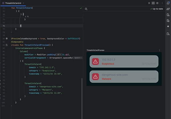
Interestingly, this principle was accidentally applied during the development of IntelliBroń Orion
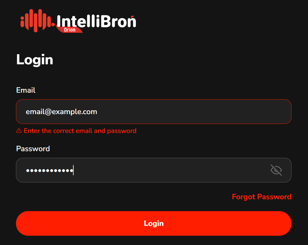
At the time, our login form had a technical limitation:
We could only display one error message for the entire authentication process.
Originally, we wanted to write two separate messages for two separate errors.
And while that would have been very helpful for users…
…it also would have been very helpful for attackers.
For example, different messages expose two critical pieces of information:
- “Username not found” → confirms whether the account exists
- “Incorrect password” → confirms the username is valid
This is exactly the type of leakage OWASP warns about.
So with our limitation of only one error string, we ended up using:
“Enter the correct email and password.”
Same response, every time, regardless of what actually failed.
No identity validation hints.
No password policy exposure.
No accidental enumeration.
Funnily enough, what began as a developer constraint ended up being a security best practice, and we intend to keep it that way.
Be The Villain 😈
One of the most important mindset shifts for a cybersecurity UX writer is learning to ask a single, powerful question:
“If I were a hacker, would this sentence help me?”
It sounds simple, but this question alone can prevent countless risks.
Because in security-focused products, copy can be a part of the attack surface.
Why this matters?
Every message we write falls into one of four categories:
- High-risk → Reveals internal operations, system logic, technical behavior
- Medium-risk → Reveals patterns, timing, or state changes attackers can map
- Low-risk → Provides user-only instructions with minimal surface area
- Safe → Defensive, generic, and intentionally unrevealing
UX writers are no longer just responsible for explaining what happened
they are responsible for not explaining what attackers want to learn.
- Assess risk: What this copy might tell to both users and hackers
- Write defensible microcopy: Refrain from leaking system processes, in some cases, always write what the users should do to move on
What This Means for Our Work
- Assess the risk
Before writing, ask:
- What does this text tell a legitimate user?
- What does this text tell a threat actor?
- Could this sentence confirm something an attacker wants to know?
- Does this reveal system behavior, timing, or architecture?
This is the UX version of “threat modeling.”
- Write defensible microcopy
Defensible microcopy is copy that:
- Doesn’t expose system internals
- Doesn’t confirm or deny sensitive conditions
- Doesn’t reveal backend behavior
- Doesn’t make it easier to enumerate users
- Doesn’t offer clues about policy, structure, or patterns
- Focuses on what the user should do, not why the system failed
For example:
❌ Bad
“We are limiting your account due to repeated failed attempts.”
✔️ Good
“We couldn’t process your request. Please try again later.”
Both messages tell the user something went wrong. Only one of them tells an attacker they triggered a rate limiting.
Sell the Experience, Not the Engine
You buy a Ferrari when you want to be somebody. You buy a Lamborghini when you ARE somebody – Frank Sinantra
When someone walks into a showroom, the salesperson rarely starts by explaining combustion ratios, wiring diagrams, or the torque curve of the engine.
Instead,
They sell the experience:
- how smooth the drive is,
- how confident you’ll feel on the highway,
- how quiet the cabin is,
- how much easier your life becomes with better handling or fuel efficiency.
The engine matters, of course it does, but the customer doesn’t need to know the exact internal configuration to appreciate the value.
They care about how it feels, not how it’s built.
In a more common example, many blogs or small business websites include a footer that literally says:
“Powered by WordPress”
“Made in Webflow”
“This site was created with Wix.com”
To be frank they won't care what built this website... they care about how it feels for them. This works fine for regular consumer websites.
But for any product that handles:
- user accounts,
- authentication,
- sensitive data,
revealing your stack becomes a security liability.
Why This Is Dangerous
When you disclose the technology behind your system, you’re also revealing:
- The CMS you’re using
- The programming language
- The framework
- The likely version
- The plugin ecosystem
- The known vulnerabilities associated with that stack
For example, WordPress plugins collectively create a globally recognized attack surface, with thousands of publicly documented vulnerabilities tied to outdated or poorly maintained components. As a result, instead of crafting a bespoke attack, threat actors often just look up “exploit for WordPress plugin Y” and follow the steps.
Google’s Security Guidelines emphasise that
"Technical implementation details should never surface in user-facing copy."
These details are gold nuggets for attackers, and useless noise for normal users.
What to Write Instead
The safest and most meaningful approach is simple:
"Learn what your product is capable of, and communicate that, not what it’s built with."
If your system is blazing fast because it uses X technology,
you don’t need to mention X at all.
You just need to tell users:
“Our platform is now faster than ever.”
If performance improves because you migrated from Technology A to Technology B, the user doesn’t need to hear about A or B.
They only need the part that matters to them:
“We’ve optimised processing to reduce wait times.”
If your new backend stack makes your system more resilient,
the architecture stays mysterious, while the message focuses on the outcome:
“Enjoy smoother performance under heavy workloads.”
Pat The User's Back For Their Efforts
So far, we’ve talked about how UX writers can protect systems by reducing what we reveal. But there’s another angle we should embrace:
Helping users protect themselves
If we want better security outcomes, we can also pivot our perspective from the system to the human.
The question becomes:
"How do we encourage users to adopt security best practices without overwhelming them?"
We should utilise behavioral design. Let's take an example for a case, such as creating a password.
Gamification Improves Password Choices
Studies by Ur et al., “Designing Password Feedback,” (CHI) show that gamified, data-driven password feedback significantly improves password quality.
Humans respond far better to meaningful feedback than to generic labels.
Which brings me to this password-strength-checker website I came across, the one that estimates how long it would take to crack your password.


It instantly made me think:
Why aren’t we using this in password creation flows?
The standard Weak / Fair / Strong meter is functional… but vague. It tells users what their password scores as, but not why it’s weak, or how to make it stronger.
By showing users something like:
“Estimated crack time: 115.53 seconds.”
or
“Estimated crack time: 34 years.”
We turn password creation into a mini challenge, which encourage the users mind to "okay let's see if I can get to x years."
The interaction feels more tangible:
“I improved the crack time from 2 minutes to 5 years — yay, good job, me.”
It sparks a tiny moment of pride, and in UX, tiny moments matter.
After all, life is short, and we deserve a little celebration here and there :)
Conclusion – Write for Users not Imposters
UX writing in cybersecurity is a strange balancing act. We still help users succeed, but now we have to make sure attackers don’t succeed because of us.
Clarity is still important. Honesty is still important. But controlled clarity and strategic honesty are even more important.
The workshop that start all this taught me something simple but uncomfortable:
- Attackers read our interfaces too.
- They study our words.
- They learn from what we reveal, and from what we forget to hide.
Security-first UX writing means:
- Keeping error messages intentionally boring.
- Avoiding oversharing.
- Thinking like an adversary.
- Focusing on outcomes, not infrastructure.
- Nudging users toward safer habits through thoughtful feedback and smart design.
In the end, UX writing for cybersecurity isn’t about making things cryptic or difficult, or make the platform boring.
Our words can become hints, clues, and breadcrumbs. But they can also be shields, and when we choose that second option, we’re shaping part of the security posture of the whole product.
Write in a way that protects people and defends systems. So the next time you write a tooltip, an error message, or a login hint, ask yourself:
“Does this help the user, or the attacker?”
If the answer is “only the user,” then congratulations, you’ve written secure UX.